This site is intended to accompany the ISWA Web Design and Multimedia course
Thursday, 28 April 2011
S2T4W5 Friday: Internet Killing, Mobile Marketing, Green Cred Redux, device recycling, Quiz Review, Quiz
_______________________
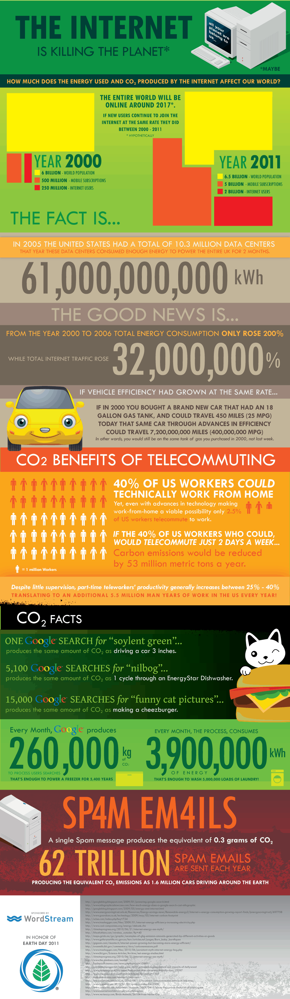
1. Internet Killing Planet?
We all use the Internet and we are ruining the world we live on every time do. Does the power of the Internet as a communication tool out-weigh the amount of CO2 released by us constantly using the internet? Have a look at some of the stats set out in the infographic below:
Information graphics, visual representations of data known as infographics, keep the web going these days. Web users, with their diminishing attention spans, are inexorably drawn to these shiny, brightly coloured messages with small, relevant, clearly-displayed nuggets of information. They’re straight to the point, usually factually interesting and often give you a wake-up call as to what those statistics really mean.
Who can resist a colourful, thoughtful venn diagram anyway?
Today is your chance to try your hand at creating your own. To do:
1. Choose a topic that lends itself to visual representation in an infographic 2. Choose a tool that lends itself to creation of the inforgraphic 3. Get started collecting any data you need. $. Create the infographic
Stat Planet allows you to create some amazing interactive visualisations, which you can then use as is or create a static image. It can be used within your browser or downloaded for free. Stat Planet gives you access to some great world data and lets you customise that in your visualisations. It also has some great map-based visualisations to try.
Hohli is an intuitive, simple online chart maker. It’s incredibly easy to pick your chart type, add some data, vary the sizes and colours and see the finished chart. The finished charts are also very well designed and look great! 3. Creately
Creately lets you make easy-to-make diagrams and flow charts (easy to collaborate too). When you start, you can choose from a number of purpose-designed diagram types and quickly add your data to make your own chart. The end result looks very professional.
New York Times’ Visualization Lab lets you use statistics from recent NYTimes articles to create visualisations in various formats. You can also see other people’s visualisations and see how other people choose to display the same data. 5. Many Eyes
Many Eyes lets you upload your own data or use data already stored on the site. The visualisations themselves are well-designed and very professional-looking. This is definitely the easiest way to use your own data for online visualisations.
6. Google Public Data
Google Public Data lets you easily take public data and transform it into an infographic of your choice. These beautiful, colourful graphics simplify and communicate the data perfectly 7. Tableau
Tableau is a free Windows-only software for creating visualisations. As you can see, these impressive graphs are colourful and quite unique.
8. Gap Minder
GapMinder is a free Adobe Air (cross-platform by nature) application to ensure you have current data on major world issues and can create visualisations for your purposes. Data is updated yearly and released with new versions of the application. The visuals are also quite impressive!
Inkscape is a free vector graphic software available for many platforms. This is the ideal free option for the creation of your overall infographic. Simple and intuitive, you should have no problems importing your visualisations and combining them with other visuals to create your masterpiece.
Wordle lets you create word visualisations using text you enter. There are plenty of interesting designs to choose from. Enter whole books, short passages or see what other people have used. In this example, we can see the US constitution visualised.
Love Infographics?
If you’re a fan of infographics, these tools will probably become part of your everyday blogging tools. Here are some great tutorials on infographic creation:


 Information graphics, visual representations of data known as infographics, keep the web going these days. Web users, with their diminishing attention spans, are inexorably drawn to these shiny, brightly coloured messages with small, relevant, clearly-displayed nuggets of information. They’re straight to the point, usually factually interesting and often give you a wake-up call as to what those statistics really mean.


No comments:
Post a Comment